Make it Pop: Designing the Perfect Poster
26.02.25
Share this


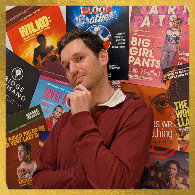
Print Distribution Manager George Rennie sees hundreds of posters every month, and has quite a few thoughts on what makes a great one. If a picture says a thousand words, here are approximately that many on five.
Also, if you are interested in what designers want you to know, make sure to check out our previous blog in collaboration with some of our favourite designers who provide their top tips for working with them.
From medieval banners to the Moulin Rouge; propaganda campaigns to the rise of digital photography, poster art has evolved across history to suit changing technologies, needs and behaviours.
Even with the explosion of online marketing, artwork is still one of the primary ways to reach audiences, creating an experience around a production and catching people’s eyes.
But what makes a good theatre poster? Here is a selection of five iconic designs from the last eighty years to highlight how we can use visual language to tell stories, guide expectations, and reel people in.
Gilda (1946)
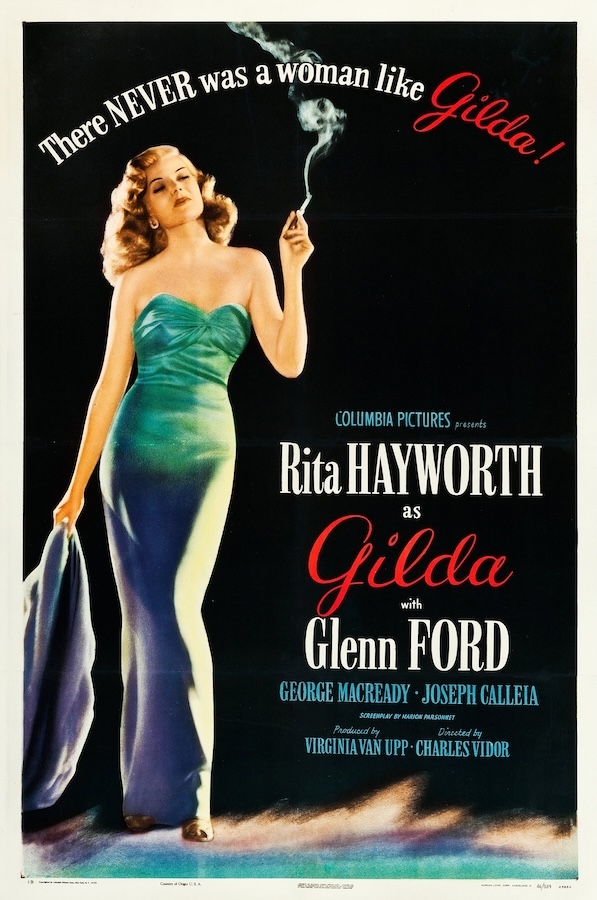
Rita Hayworth stands out in this striking, sensual design which ranked top of the American Film Institute's 2003 list of poster classics. It’s actually the style B for the show’s marketing – it being more commonplace at the time to have multiple variants for any given film – but it’s so bold and simple that this is the design that lasted, even appearing in The Shawshank Redemption (1994) and Mulholland Drive (2001). Behind its clean layout and single image, there’s a great amount of detail, from the multiple typefaces used to the colour and texture of her dress. The effect is painterly, and the image wouldn’t convey the same mystery without the shadow on her lower half. The feathery brushstrokes of the ground convey something romantic and ephemeral – playing into the tagline which itself uses the cursive red ‘Gilda’ to demonstrate its point: she is exceptional, she stands out, there’s nothing like her – and therefore nothing like this film. The posture captures Hayworth’s unequivocal star quality, and the casually superior attitude of the ‘femme fatale’ align it clearly with the film noir genre while foregrounding her femininity.
Star Wars (1977), designed by Tom Jung (left) and Tom Chantrell (right)
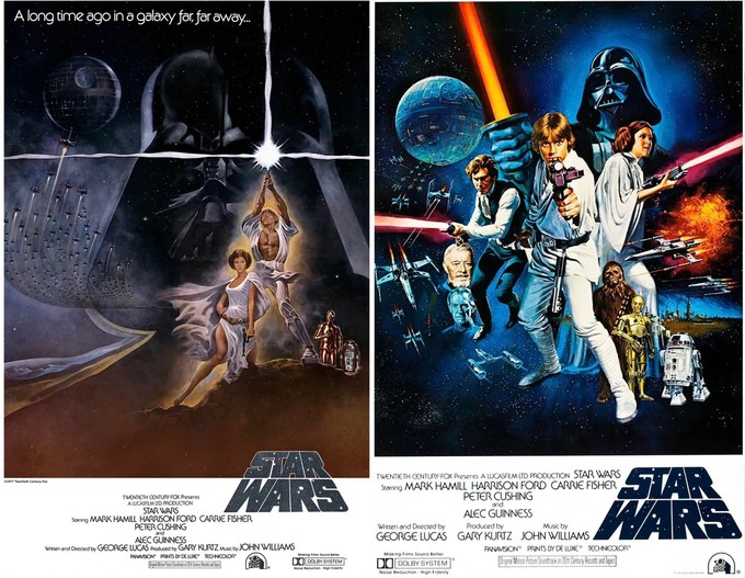
There’s debate over which of these designs constitutes the ‘official’ first Star Wars movie poster, with Tom Jung’s left-hand image conveying something more ancient and mythical, and Tom Chantrell’s on the right possessing more action and pop. Before photography became the primary feature of movie posters, hand-made images reigned supreme, with Jung’s heavy influence from comic books tying together the film’s exemplary ‘hero’s journey’ elements and fairytale origin. The layout of Chantrell’s image, supposedly inspired by The Dirty Dozen, has now been replicated so many times it’s become a style in its own right, showing off the ensemble cast in order of significance to the story, using an incredibly artful balance of colour, positioning, movement, distance and angle. You can really get lost in it, and it gives the sense not only of an action-packed adventure, but a whole universe to be explored.
Cats (1981), designed by Dewynters
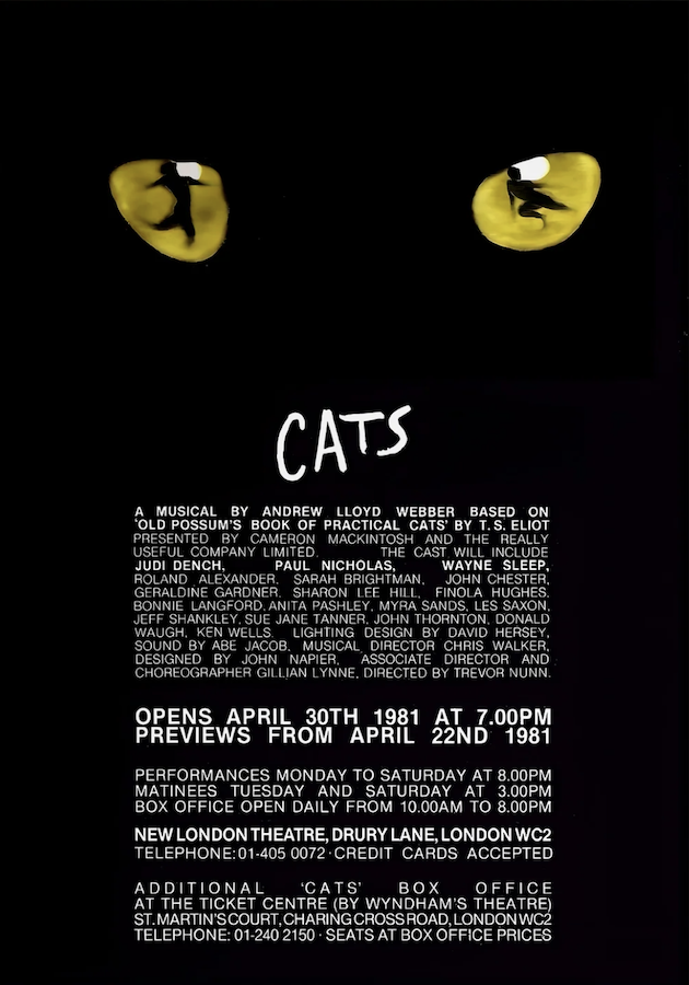
Following the trend of the film industry, the 1980s saw a shift away from photo/star-heavy theatre poster images towards the globally exportable ‘brand’. When developing the poster for Andrew Lloyd Webber’s Cats, marketing agency Dewynters came up with a design so minimal that it prompted the producers to shorten the title from its original, Practical Cats. The title font is elegant and sleek, and the eyes look directly at you, inviting you to see the feline dancer within. On this shift in artwork design, John F. Snelson observes: “Posters moved away from telling us what a show was about to telling us what it was like. One white mask and a red rose on a black background told us that this Phantom of the Opera was not so much horror story as gothic romance.” Keeping things in the ‘vibe’ sphere and using coding not only makes audiences feel more sophisticated, but it also allows for the creation of a plethora of alternative versions and merchandise, ideal for a globalised entertainment economy.
Shubbak (2019), designed by Emma Cooke
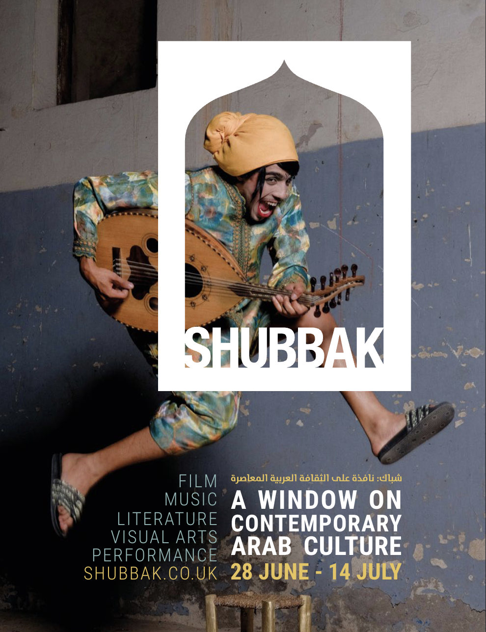
This is an absolute Mobius favourite for its incredible dynamism and energy. A great example of photography and graphic design working in tandem to tell a story and create a feeling – whilst also providing all the key information in a clear and readable way. Note how the colours of the text match the figure’s outfit, how the text on the left follows the shape of his leg, how the ‘window on contemporary Arab culture’ mirrors the window-like logo, highlighting the joyous, cheeky expression on his face whilst also suggesting that there’s much more beyond what you can see. It’s a brilliant example of a poster reflecting the energy, joy and vitality of the art and artists, and linking traditional artforms with a contemporary framing (in this case, quite literally).
Abi Clarke: (Role) Model (2024), designed by Jonny Woolley, photographed by Dylan Woodley and with make-up by Olivia Davey
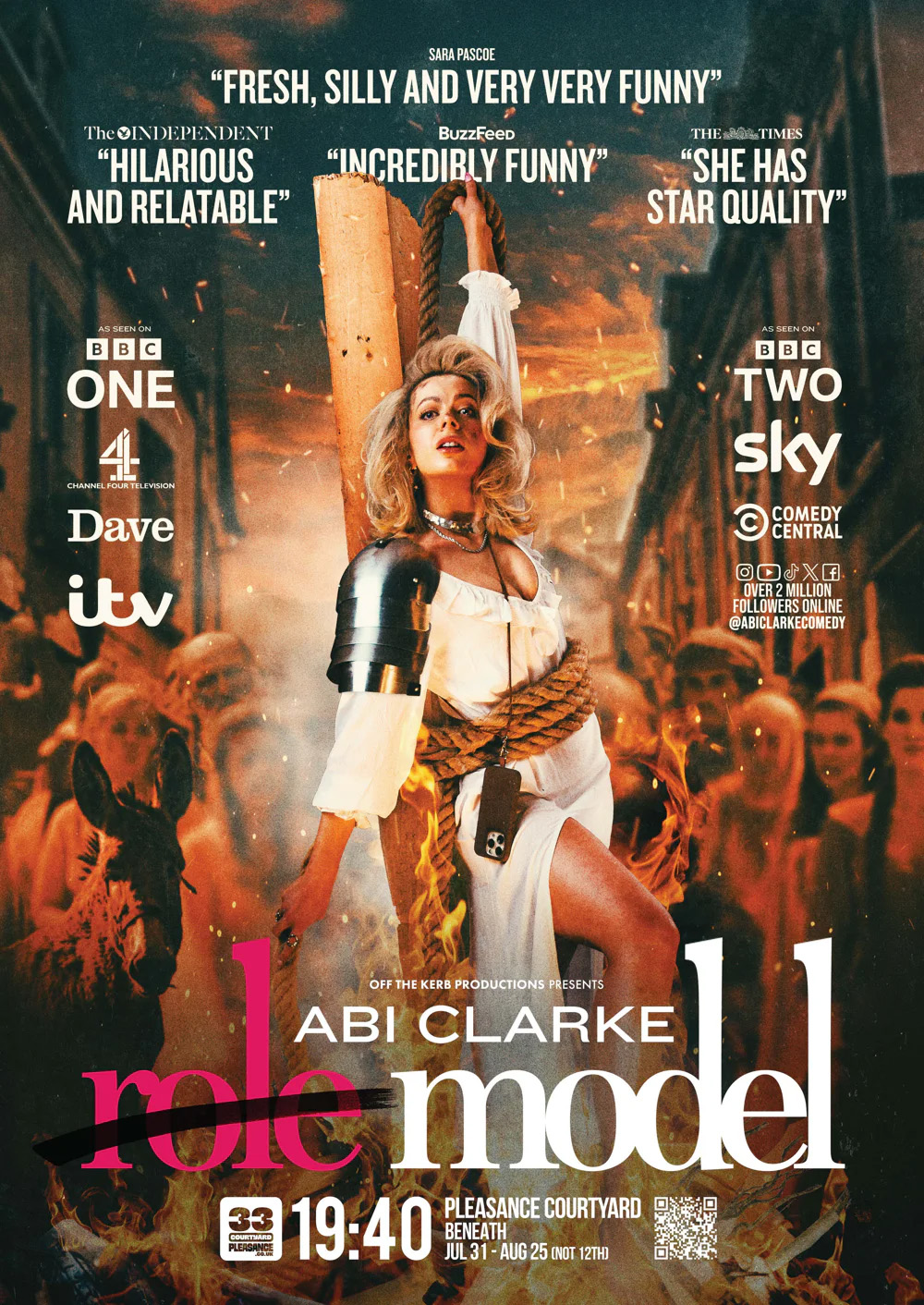
Comedian Abi Clarke won the Chortle Comedy Poster Award at Edinburgh Fringe last year with this sizzling mashup of America’s Next Top Model and Joan of Arc. It stands out on so many levels: its clever appropriation of well-known brands, maximalist blending of competing elements, visually manipulative use of layers, colour and blur, cinematic polish and a standout pose that just screams ‘energy’. Fading to shadow at the bottom of the image makes the title and details really stand out, and the way the pull quotes interact with the image gives a sense of playfulness and dimensionality. It looks epic and poppy, classical and modern, feminine, fierce and fun: a poster that creates heat and atmosphere to tell you that this is an event you do not want to miss.
Takeaways
Studying these examples gives practical, teachable hints on what makes something stand out in a highly competitive and visually saturated market. Taking examples of your competitors can be helpful to know how others have used visual elements to connect product, brand and audience, but looking to visual art, photographic references and even getting back to pencil and paper can help refine your design and come up with something new.
The key thing is to do something authentic, unique and high-quality. Play with ideas, try things out, and think about where people will see it. While it’s essential to have practical details presented clearly, you’re also looking to capture an essence, moment or feeling. Who are you speaking to and what do you want to say? Once you’ve got an idea, pull together all the relevant visual references, and find a way to communicate these with any collaborators.
Visual language is a craft of its own, and for most of us, working with a professional photographer/designer is going to help us speak it much more effectively. Some of our favourites can be found here, and the door is always open if you’d like to discuss how we can support your next project.
If you'd like to keep up to date with all our blog posts, important and interesting stories in the worlds of theatre, arts and media, plus job ads and opportunities from our industry friends, sign up to our daily media briefing at this link.
