Designing With Impact
22.09.26
Share this


Key art, web design and carousels: visual design has never been more important, especially since Meta (including IG) has become the primary space for artists and producers to promote their work.
In this blog, Senior Distribution Manager George Rennie looks at graphic design in the age of AI and Canva, exploring the psychology of how we read visuals, and highlighting how we can help people do it better.
As someone who came into the world of theatre marketing as a writer/performer, making sense of visual design was a rather steep learning curve, one that has been sped up by the rise of Canva with its user-friendly interface, ready-made templates and multi-functional capabilities. Add to that the rise of AI, and now it seems anyone can be a designer. Or can they?
I spoke to several designers about their approach to visual communications, learning about the principles that underlie good design and getting a crash course in the theory of how we read graphics. It’s something we, our street team and audiences do every day, but often it works without us realising. Here are some of the principles that designers think about when guiding readers’ attention.
Brand/Feeling
This is how designers convey emotive and artistic content to an audience, reflecting the qualities associated with the experience being offered. What iconography is involved? What is the feeling evoked: Is it clear and sunny? Serious and informative? Playfully historical?
Getting this right early is one of the biggest roles a designer plays, as it establishes a visual language that you can subsequently use to immediately connect with audiences by indicating what you have to offer.
Colour Theme
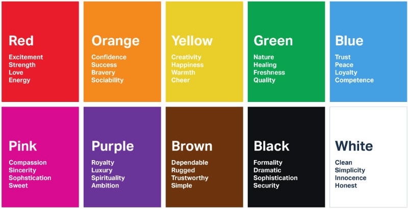
As much as colour conveys the world and feel of a show, it also plays a significant role in guiding the eye and improving readability, with more contrasting colours standing out against the background. Meanings and associations are highly subjective and change with context, but some useful general spectrums to think about are hot/warm/cool/cold, bright/subdued, natural/artificial, past/future. Different combinations are more likely to prompt certain emotions and speak to the brand and feel of a design.
Hierarchies of Attention
Designs often need to operate on multiple levels of attention, first grabbing your peripheral awareness then pulling your eyes in with bright colours, striking images and layouts that prompt curiosity and emotion. Once you’re in, then there is all the top layer information to deliver, followed by deeper, more detailed information.
From titles to subtitles to body copy and small print, the size and boldness of text follows the journey above, with top level info live titles and names, being followed by a hook or subtitle: what information is most important to convey up-front and encourage people to read on.
As much graphic design seems inherently more creative than a written document, much of it comes down to conveying information clearly and in the right order, whether that’s to do with the offer, emotional content or practical details.
Title Treatment
This can often cross into logo territory so it’s worth spending the time on. As most shows are creative entities, playful title treatments often incorporate more unique and irregular features, using typeface, ornamentation and dimensionality to speak to the world of the play.
Take a look at the examples below and see how they speak to the brand/quality of the shows:
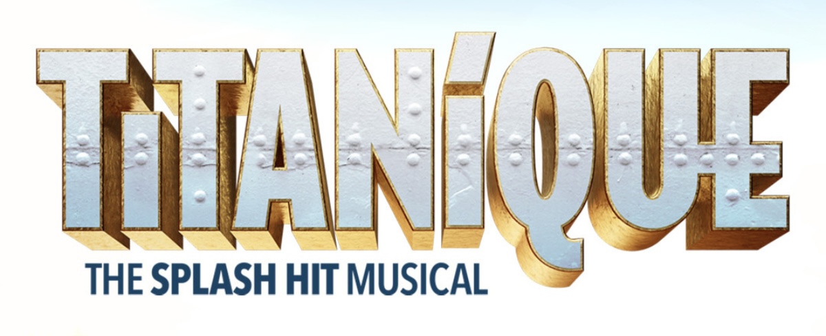
Bold, epic three-dimensional font that feels glitzy and commercial and is made of the ship.
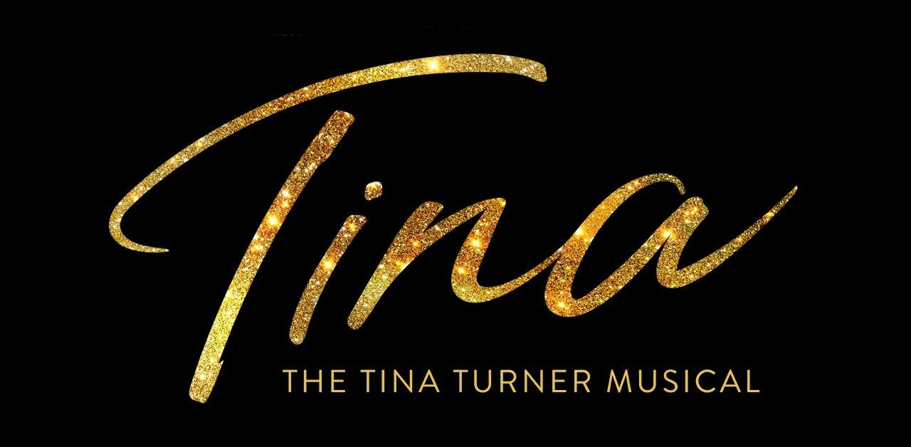
A sparkly hand-written signature - this is her show and it's fabulous.
.jpeg)
Bold, vintage lettering that feels handpainted on a placard: this is old-school protest art.
Secondary/Heading Font
This is less vibey and more informational, so should be strong and easy to read. It should be able to sit comfortably below or near the title treatment, e.g. for a show tagline. Contrast should be for visual impact only and should not create a confusing project identity. Body copy will likely be a similar font, and it’s not necessary to spend a long time choosing these. Just make some quick decisions, e.g. serif or sans-serif, and then choose one that looks good with the overall design. The main focus is on i) ease of reading and ii) that it’s in keeping with the brand styling you’ve created.
Spatial Arrangement
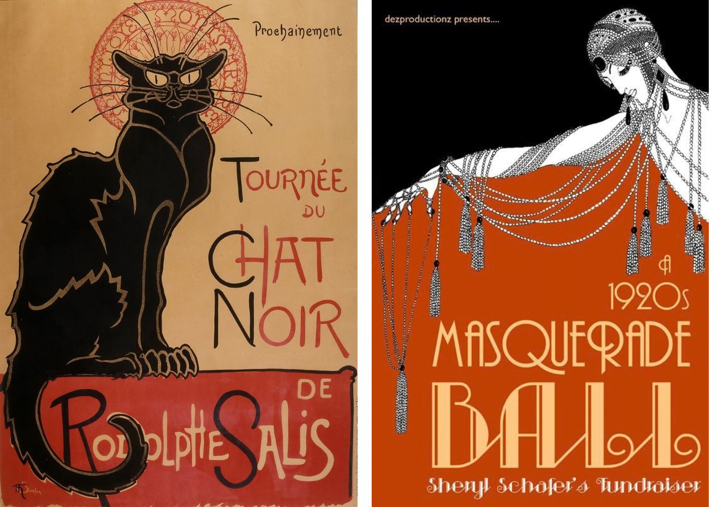
Images and text should be arranged to guide the eye along the hierarchy of information in the correct order, and also create a sense of balance and harmony, as this is easier for the eye to look at. Negative space is essential here, as well as directionality and the relationship between text and image. One designer friend I know uses Art Nouveau or Soviet-era posters as a basis for his designs as they do this exceptionally well.
Typesetting
It’s easier for the eye to read blocks of text that are aligned to the left than centre- or right-aligned, as the eye knows exactly where to go back to to reach the next line when you reach the end. Keep an eye on line length as the longer the line of text, the harder it is for the eye to track back to the start of the next line. It’s also worth looking at line endings, and manually adjusting any awkward outliers to smooth the reading experience and give a more pleasant shape to the block of text.
The Design Process
Writing a Brief
This is an essential part of the process to identify what it is you are trying to create, for what purpose and how. This can draw from other references, consider who it’s going to reach, and the messages/qualities the design assets are going to possess. If you’re wearing a selection of hats, identify your multiple roles in a project, e.g. from creative writer/actor to designer and marketing manager, and try to wear the appropriate hat for each part of the job. When finalising a design, check it against your original idea or brief.
Intuition vs. Planning
So much of design comes through practice and experience, even if you don’t know why something is or isn’t working. Getting your materials checked by lay people and experts will help reveal what immediate reactions you’re getting, and whether the design is conveying the right things. If you are clear on what these should be, then hearing what people’s honest reactions are will help you refine your assets. As with anything creative, it’s a blend of strategy and intuition. But the key thing is to remember that you are designing to have a specific impact on other people. So, the more you can get out of your head and into other people’s the better able you will be to design with impact.
If you are looking for a graphic designer for a project, we will happily advise on some of our favourites. We can also help manage this process, as well as any other marketing needs you may have. Get in touch today and we will happily set up a chat!
If you'd like to keep up to date with all our blog posts, important and interesting stories in the worlds of theatre, arts and media, plus job ads and opportunities from our industry friends, sign up to our daily media briefing at this link.
